|| The Sacred Grove ||
A hidden realm where mystery and nature intertwine—a dense, untamed forest veiled in shadows and alive with whispers.


T H E B R I E F
Designing a collection of bedding prints for the season A/W 26/27. The collection should capture the essence of the season while aligning with current and emerging design trends. The prints should be aesthetically appealing and marketable.
The theme should be consistent with Welspun’s brand Recology’s design language, and the brand research that has been undertaken, making it suitable for the target market’s preferences.
T R E N D-M A P P I N G & R E S E A R C H
The trend research for A/W 26/27, derived from the Geo-Logic section, is informed by WGSN insights and reflects a grounded response to climate consciousness, mental wellness, and nature-inspired aesthetics. The research explores two key narratives: Illuminated Tropics and Elemental Origins, with a coordinated story around Unearthed Botanicals.


watercolor renders
large scale motifs
realistic
botanical silhouettes
hand-painted motifs
all over surfaces
packed petals
detailed illustrations
line art
solid colored elements


B R A N D R E S E A R C H
Since the home and lifestyle sector has an expansive international clientele, a curated set of retail brands mentioned in the upcoming pages were selected as sample case studies.
Each brand reflected a different segment of the market, ranging from budget-friendly essentials to premium homeware, with factors such as mass-market functionality, affordability, high-end and design-conscious approaches, material quality, and a blend of all the above being considered.
The defined design language to be taken forward was compared to the trend research as well to ensure no loopholes were created.
Key motifs include stylized forest animals and layered foliage with dark backgrounds
Earth-based palettes and materials, such as terracotta impressions and clay tones, are promising avenues for future design exploration
D E S I G N D I R E C T I O N S
A focus on touch and tactility - through surface manipulation and dimensional techniques - can deepen user engagement
The adult trend research, inspired by WGSN’s Geo-Logic forecast for Autumn/Winter 2026–27, reflects a deep alignment with themes of climate consciousness, mental wellness, and nature derived aesthetics. It is structured around three core narratives- Illuminated Tropics, Elemental Origins and Unearthed Botanicals.
The concept of “designing with darkness” could serve as a fresh lens for wellness driven interiors
Visual storytelling using dense, layered compositions could lend emotional depth to the adult collection.
Earth-Centric & Moss Textures: To bring raw, organic forms and forest floor-inspired surfaces into focus.

Motif Library
E X P L O R A T I O N S


%20copy.png)

%20copy.png)
%20copy.png)


%20copy.png)


%20copy.png)
%20copy.png)

F I N A L I S E D M O T I F S


L A Y O U T E X P L O R A T I O N S
For the layouting, a brainstorm session including sketches and narratives following a strategic design process was done. It was aimed at building a cohesive yet versatile collection rooted in tropical storytelling. A lot of back-and-forth process also happened as a part of the experimentation with layouts.


D U V E T C O V E R F A C E


The initial banana tree motifs were arranged in a tight repeat but felt too monotonous for a main print. To enhance visual interest, the layout was reworked into a panelled composition with varied scales. An additional banana tree motif was introduced in the same style to reduce empty space, while base foliage was layered in the foreground to replicate the dense, multi-layered depth of a rainforest environment.
The final duvet layout featured a bottom-heavy panelled print inspired by rainforest floors, with layered foliage and varied tree heights. Color palettes distinguished depth, while taller trees were repositioned slightly lower to remain visible even when the duvet is folded, ensuring balance and completeness in both flat and real-use views.


D U V E T C O V E R B A C K

Several reverse print options were explored—from leopard textures to large-scale macaws—but most felt either overpowering or too repetitive.
. The final version features six distinct macaws, spaced thoughtfully within a 6-inch repeat, creating subtle interest without stealing focus from the main print.


S H E E T S E T

Diagonal stitch lines were ruled out as impractical unless quilted, and visually out of sync with the collection. Instead, a scaled-down, tone on-tone leopard print was repurposed for the sheet set, resembling a minimal ditsy floral for subtle coordination.


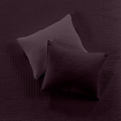
P I L L O W S & D E C O R A T I V E C U S H I ON S

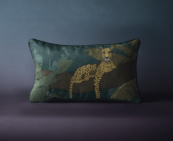
Initial pillowcase designs with monstera leaf panels didn’t align well with the rest of the collection. After experimenting with layered banana trees, the final artwork featured a serene leopard resting on a branch—bringing visual balance and narrative cohesion to the print story.

Three key techniques were explored in the cushion development: chain stitch embroidery over leaf stencils for texture and definition, individual petal panels stitched together to form sculptural surfaces, and tonal smocking— where textured fabric was layered over a base of the same color to add subtle depth without disrupting visual harmony.


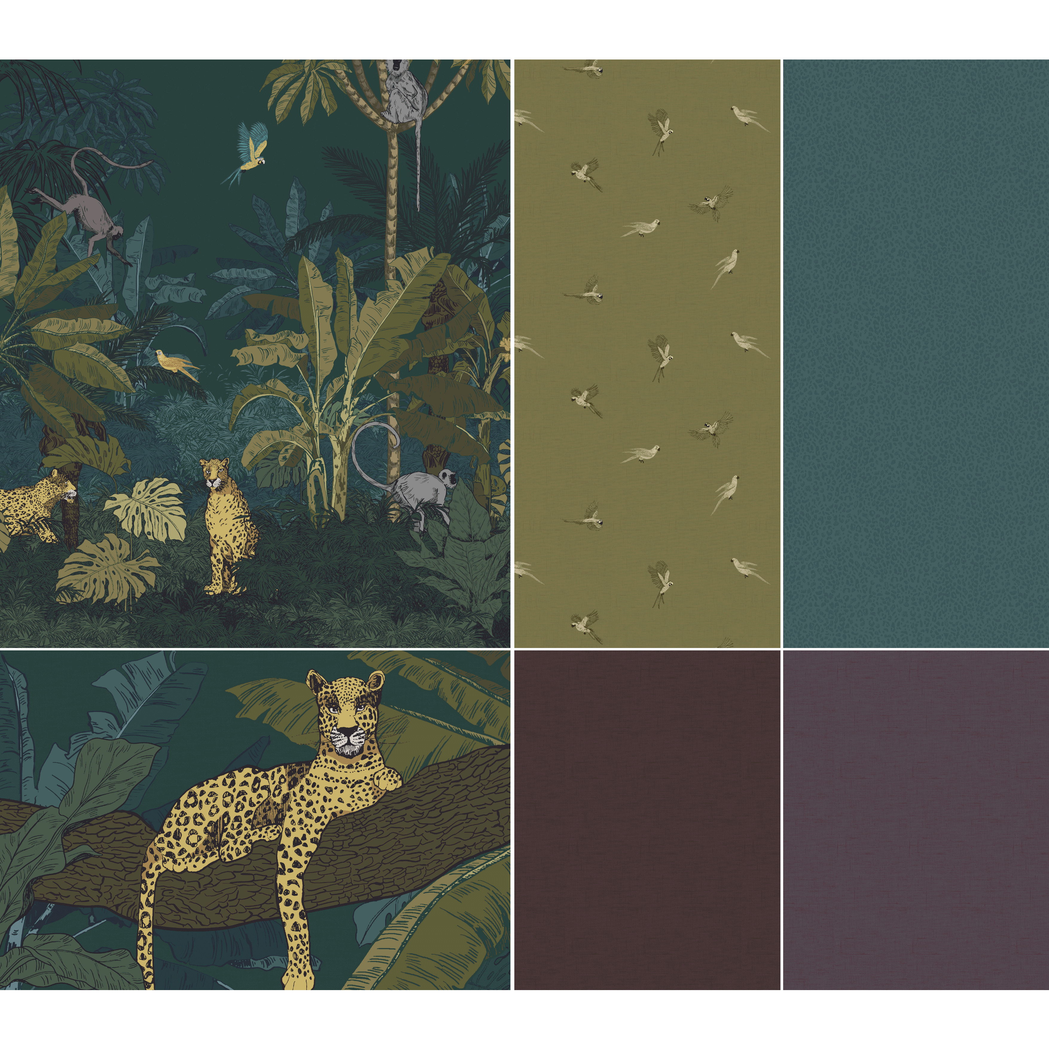
The colorways for the collection were derived from WGSN’s global color forecast, ensuring alignment with upcoming seasonal trends. The palette blends grounded earth tones with soft, mood-enhancing hues to support the themes of nature, wellness, and emotional comfort—creating a balanced, globally relevant combination that resonates with both aesthetic appeal and consumer sensibility.