
|| Froggy Long Legs ||
Froggy Long Legs is a splashy, giggly adventure that helps kids learn about biodiversity, frogs in danger, and how even the tiniest creatures play big roles in our Earth’s story!


T H E B R I E F
Designing a collection of bedding prints for the season A/W 26/27. The collection should capture the essence of the season while aligning with current and emerging design trends. The prints should be aesthetically appealing and marketable.
The theme should be consistent with Welspun’s brand Recology’s design language, and the brand research that has been undertaken, making it suitable for the target market’s preferences.
T R E N D-M A P P I N G & R E S E A R C H
The trend research for A/W 26/27 is also, like the adults' collection, derived from the Geo-Logic section, and is informed by WGSN insights and reflects a grounded response to climate consciousness, mental wellness, and nature-inspired aesthetics. The research explores two key narratives: Science with Soul and Hothouse Florals, with a coordinated story around Mindful Connections.


cute animal motifs
solid colors
bright colors
disney prints
shaped cushions
bubble text
fantasy themes
pastels
soft silhouettes
stylized animals
fluffy textures
rounded silhouettes


B R A N D R E S E A R C H
The first step of the project involved conducting in-depth market research to understand the children’s home and lifestyle segment through the lenses of design language, target users, and prevailing trends. Given the global nature of this market, a curated selection of retail brands was chosen for case studies—each representing a distinct category, from affordable everyday essentials to premium, design-forward offerings. Key factors considered included child focused usability, safety, aesthetic appeal, affordability, and material quality.
Soft silhouettes, rounded forms, and tactile surfaces such as sensory-friendly textures or applique work are emphasized
Positive slogans and geological motifs are integrated to nurture curiosity and mindfulness
D E S I G N D I R E C T I O N S
The visual direction includes stylized animal characters, flat color compositions, and light storytelling geared toward climate awareness
The kids’ trend research mirrors the adult narratives but filters them through playful, educational, and emotionally sensitive lenses. The major trends considered were Science with Soul, Hothouse Plants, and Mindful Connections.
Designs can balance educational intent with visual joy, appealing to both children and their parents
Affirmative messaging embedded into prints can serve as subtle behavioral tools promoting eco awareness and self assurance
Visual languages that combine storytelling and climate conscious themes can build emotionally rich product ranges

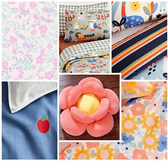
Motif Library
E X P L O R A T I O N S


F I N A L I S E D M O T I F S


L A Y O U T E X P L O R A T I O N S
The ideas for the second collection’s layout demonstrate a light-hearted, concept driven research based on young curiosity and creative engagement. The first step in the design process is choosing duvet front layouts that strike a balance between simplicity and narrative. Every choice takes a different narrative stance: In order to create visual depth and scene-building.

D U V E T C O V E R F A C E


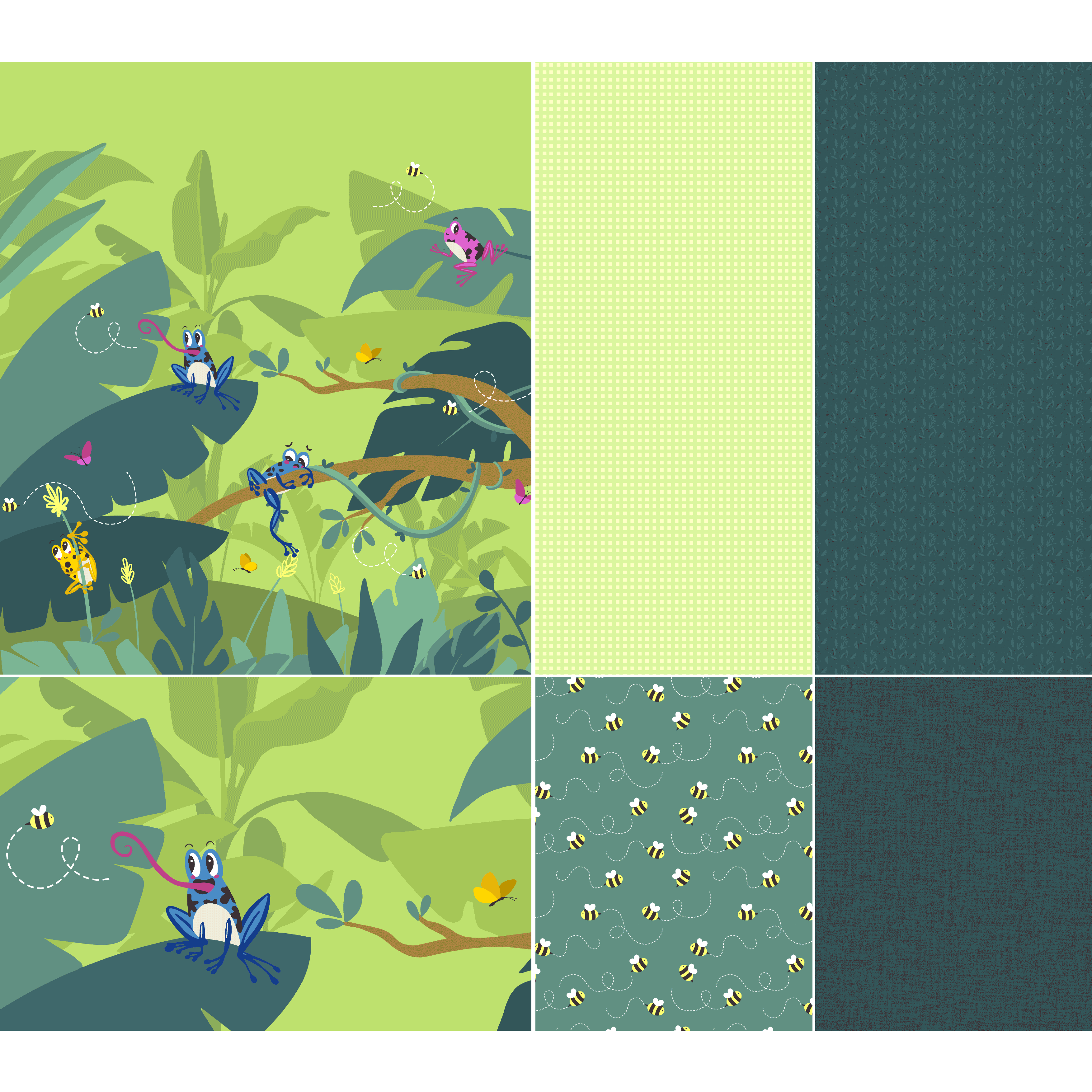
The layout began with broad leaves in repeat, later enhanced with fern motifs for more variety. Leaf placement and background color were refined for better balance. Initially limited to three frogs for rotary printing, the design lacked appeal, so the medium was switched to digital to allow for more detail and color.
With the shift to digital printing, more frogs were added and repositioned multiple times to enhance the layout. The final version featured a half drop repeat, but despite the refined arrangement, it lacked the narrative strength and dimensionality required for the concept—so it was ultimately not taken forward.
The revised layout featured colorful frogs on a light grass-textured background, arranged in a half-drop repeat. However, despite the adjustments, the surface lacked the impact needed for a main print and didn’t carry enough visual weight, leading to the decision to not take it forward in the final collection.


The repeat print idea was replaced with a fresh panelled layout featuring varied foliage on a warmer green background to soften contrast. Bees were added for movement and charm, later resized and repositioned to improve proportion and ensure visibility even when the duvet is folded—enhancing both storytelling and practicality.
To enhance visual variety, butterflies were added alongside bees. Poison dart frogs were introduced with minimal repositioning, while flat meadows were placed behind shrubs to ground the foliage. A tone on-tone foliage layer in the background added subtle depth, resulting in a well-balanced, immersive print rich in character and storytelling.


D U V E T C O V E R B A C K


The earlier grassy background was updated to match the new color palette but didn’t align stylistically with the main print.
To maintain harmony, it was replaced with a simplified check pattern in coordinating colors— subtle enough to support the main print without overpowering it, ensuring a clean and cohesive look.


S H E E T S E T

The poison dart frog print was revisited on a darker background but ultimately set aside to keep the sheet set visually subdued. Instead, an all over foliage print using leftover sketches was created, toned down to three colors and scaled by 50%—resulting in a ditsy-style, understated print that complements the main design.


C O V E R L E T F R O N T

An all-over bee print with a woven texture background was initially developed but later simplified to suit the kid-friendly intent of the product. The bee sizes were increased to better match those in the main print, ensuring consistency in scale and visual flow across the collection's coordinated pieces.


D E C O R A T I V E C U S H I O N S

The cushion design began with a bee and heart-shaped trail in applique and embroidery, later enhanced with bee-themed puns like “bee kind” using boucle for a playful touch. Through iterations, key elements like the frog and bees were edited out for balance for the second cushion, with the final version featuring clean foliage and satin stitch embroidery - paired with a standalone frog-shaped cushion.


The colorways for the collection were derived from WGSN’s global color forecast, ensuring alignment with upcoming seasonal trends. The palette blends grounded earth tones with soft, mood-enhancing hues to support the themes of nature, wellness, and emotional comfort—creating a balanced, globally relevant combination that resonates with both aesthetic appeal and consumer sensibility

